00:00
00:00
RAWRoutLOWD
Lowdtown Friends & Freaks

Age 34, Male

Student

Parsons School of Design

Brooklyn, NY

Joined on 8/16/05

Level:
3
Exp Points:
60 / 100
Exp Rank:
> 100,000
Vote Power:
2.97 votes
Rank:
Civilian
Global Rank:
> 100,000
Blams:
4
Saves:
15
B/P Bonus:
0%
Whistle:
Normal
Trophies:
6
Medals:
11

New T-shirt Design: Comments/Critiques?

Posted by RAWRoutLOWD - July 11th, 2008


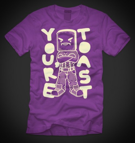
Hey this is a new design I worked on. It will most likely not get printed, but I kind of liked it so I wanted to hear what you guys think.

I just wanted to make a badass piece of toast.
It's a 5-color print on purple, but it works on a load of other colors too.

Tell me what you think! Like it, dislike it? What could I improve? Anything!

-------------
*Update* I made the grapic a bit smaller.
*Update 2* I made the toast graphic just an outline.
*Update 3* It looked sad without any shading whatsoever, so I added a diagonal halftone.
Here's a more detailed look: Click here
*Update 4* Made the graphic smaller.
-------------
Thanks a lot guys! I really appreciate all your advice. This is actually turning into something really worth printing.

New T-shirt Design: Comments/Critiques?


Comments

that actually lookes like something worth printing

you think so? maybe like a super limited print or something.

If I get more requests to print it, I might consider.

no its too big, make it smaller...

Made it a little smaller

yea i agree make it smaller ... and it looks great

Smaller would be nice, but actually, I think you should put the holes in the letters. I know that might ruin the style slightly, but just small holes i think would be better if you make the image that big on the shirt. I likes it though!

Thanks for the tip. I tried adding the holes, but it didn't look that good. I appreciate the advice though.

Maybe a little background painting would help , something simple

the toast guy is too big if he's going to be in full color like that, try making him in a outline or a solid color.

I'd like to see it all one solid color faded on that purple.

Thanks a lot, buddy! I really appreciate your advice coming from a fellow illustrator. I changed the graphic into one single color. Any thoughts?

What do you think about the color choice? It doesn't come up too well on-screen but the graphic is an off-white ivory color on the purple shirt. Do you think there are other combinations that would work better?

I'm not really sure what you meant by "one sold color faded on that purple"

"It doesn't come up too well on-screen but the graphic is an off-white ivory color on the purple shirt. Do you think there are other combinations that would work better?"

I'd suggest having a black t-shirt and print being neon green. I know it's well, out there, but that's what you see a lot of teens wearing these days, black/white shirts with neon prints.

But with saying this, the should would have the slogan smaller, but repeated many times. So I guess what I'm getting at is:

Neutral Colour: Black/White
Smaller slogan/text but more of it, also text should be neon colour.

Idk, just coming from a 14 year old kid. Try out a version like this if you want?

yea, I tried out the black/neon green combination but it didn't look too good. With what you said, even though it's a pretty popular color combination, that's what makes it uninteresting. I want something fresh and original, that's why I like the ivory/purple combo.

Repeating the slogan makes the design too busy, IMO. And I personally designed the text so that it would be to the sides of the toast. So it wouldn't repeat well even if I tried.

Thanks a lot for your opinion though.

Great shirt design. I agree with everyone to make it a little smaller but really, great job man I'd wear that shirt and act really cool and people would be like "OH i see what he's getting at, he's cool"
People already do that.. but the shirt would make more people do it. Because toast

to big, no one likes pounds of acrylic plastered across their chest.

Is that small enough, or should it be smaller? I still want to keep the print pretty big and bold. But I still made the print significantly smaller than the last revision.

I like the shirt, I probably wouldn't buy it myself just cause that's not personally my style (I more enjoy the shirts with the tiny, tiny little logos or no logos at all on them, I'm not a walking billboard), but there would definately be a market for these shirts.

The shirt looks nice, I just don't like purple that much. However changing the color might change how the shirt looks overall making it not look so nice anymore. Meh.

You should print it, I'd buy myself one.

P.S. What your website again?

thanks, I'm thinking about doing a limited print, so I'll let you know if/when I do.

http://www.rawrclothing.com

This looks buyable! I think that the graphic is well drawn and a decent size. Well Done!

yo if you our printing it, i would standardly buy one, that is as fly as hell, think about it man.

I think it looks great, I'd consider buying one. Is there any way you could show us what it looks like with holes too?

That's awesome man! I'd tottally buy it.

It's pretty cool i would buy it You should definatly print it.

lol

Me likes it.

I love toast.

I really like it! I'd even be willing to buy one! Great design :P

More Results